
How to build a website which converts email subscribers
Over the last 2 months, Marketing Examples welcomed 31,000 first time visitors. 4,100 of these visitors subscribed to the email list. That’s an email opt-in of 12.9%.
The industry average is 2%. The top 10 percentile average is 5%. So, screw it, I’ll go there:
Marketing Examples is one of the best websites in the world at converting passers-by into email subscribers.
What follows is a series of things I've observed whilst trying to build a website which maximises email subscribers.
Being obvious works
I imagine a few of you have read The Alchemist. Pretty good book right? How many of you signed up to Paulo Coelho's email list?
No matter how amazing your work no one is going to go out of their way to sign up to your email list. You have to make it obvious. Incredibly obvious.
There are four ways to sign up to the Marketing Examples email list:
1) From the fixed position navbar
2) At the end of any article
3) Through the exit intent popup
4) Directly from the subscribe page
From any given point you're only one click away from subscribing:
Popup timing matters
I went to a museum recently. On my way out a member of staff told me that every time a new exhibition opens they send out an email and asked whether I'd like to sign up. I said sure.
Now, imagine a parallel universe. Ten seconds after I walk through the museum's doors the same lady jumps out in front of me and asks if I’d like to join the email list.
The latter is how most popups do work. The former is how they should work. For those unfamiliar, I'm talking about exit intent popups.
The benefit is clear. In waiting until a user is ready to exit your website you're not going to annoy them by springing open a popup whilst they’re in the middle of an article.
Popups run the game
If human behaviour was rational the exit intent popup on Marketing Examples would be futile. Users have already seen the email box on the home page or at the end of an article. Surely they've already decided whether or not to sign up?
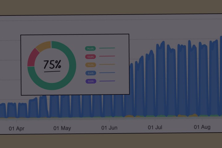
Well, not quite. Here is a graph showing Marketing Examples subscribers by source:
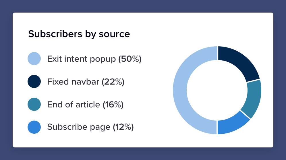
The “futile” popup contributes 50% of total sign-ups (all of whom were about to leave the website). Without it Marketing Examples would currently have 2900 subscribers instead of 5800.
*See end of article for popup implementation.
Subscribe pages work
The benefit of a dedicated subscribe page is that it allows you to link directly to your email list.
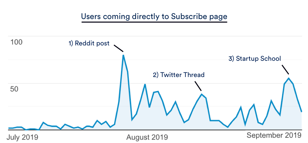
This means any value I create on other platforms (Twitter, Reddit, Startup School, etc ...) can be converted directly into email subscribers rather than just exchanged for a website session.
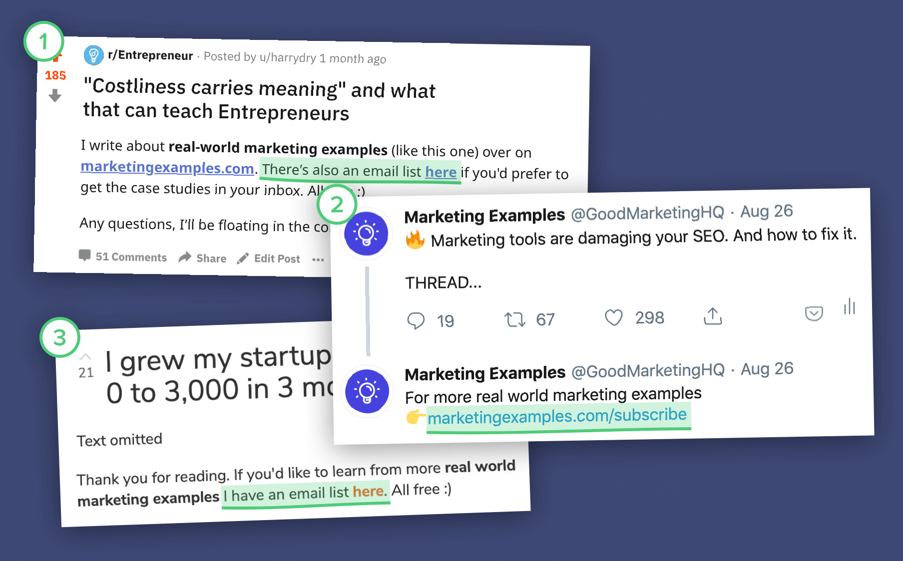
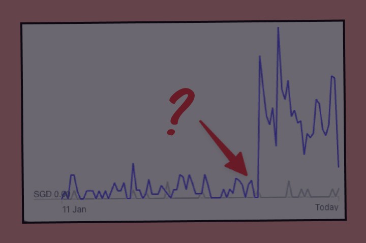
And it works. Over the past 3 months 1070 users have come directly to the subscribe page (45% of whom joined the email list). You’ll notice the little spikes every time an article gains traction on another platform.
Asking personally works
The most surefire way of getting someone to do something is (drum roll, please) ... ask them personally. It’s hardly rocket science. Humans respond better to humans than they do to a little box with the word “Subscribe” on.
For instance, if Kanye West was in the business of growing an email list he should write:
Hi, I’m creative genius Kanye West. Every song I make is dope. If you want to get notified when I make a new one pop your email in the box below.
On YouTube people get this. Most videos include some sort of personal call to action — “Hit the subscribe button”. But on websites impersonal email boxes remain the modus operandi.
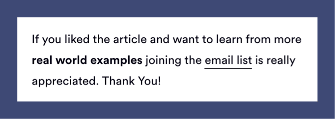
On observing this I added a gentle personal nudge to every Marketing Examples case study:
Appearance matters
Everything up to now has been focused on perfecting structure. But it’s not going to count for much if your email box still looks like this:

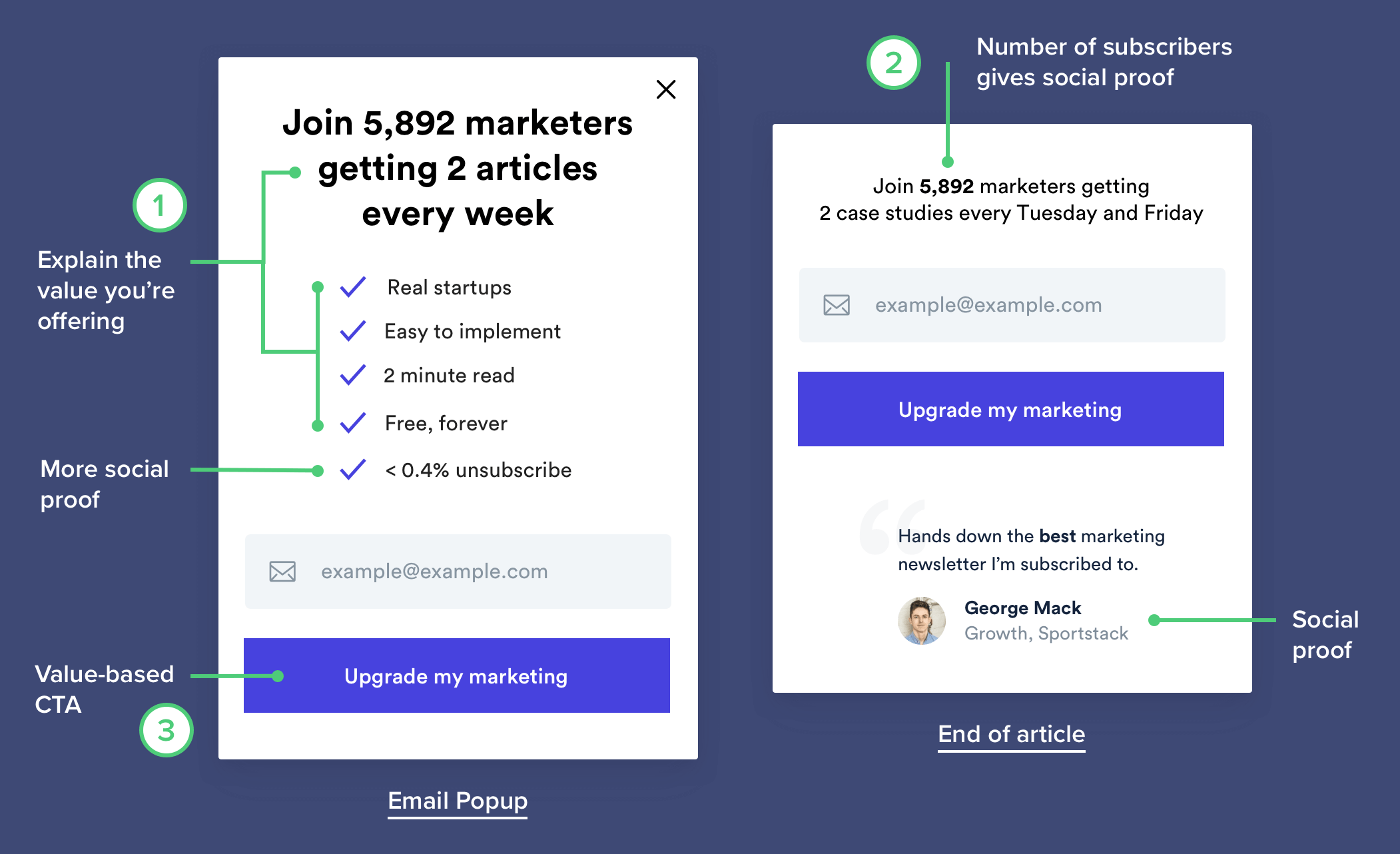
I've got 3 simple rules to improve any email section:
1) Explain why people should sign up
2) Add social proof (e.g. Number of subscribers, unsubscribe rate, quote)
3) Replace “Subscribe” with a value-based CTA
Summary
Choosing whether or not to subscribe to an email list is a split-second decision. This means that subtle psychological tweaks can make a big difference.
Here’s the checklist:
1) Make it obvious
2) Use an exit-intent popup
3) Get a subscribe page
4) Ask as a human
5) Give a clear reason to sign up
6) Add Social Proof
7) Use value-based messaging
*Popup Implementation
Exit-intent popup implementation is easier than you think. With code:
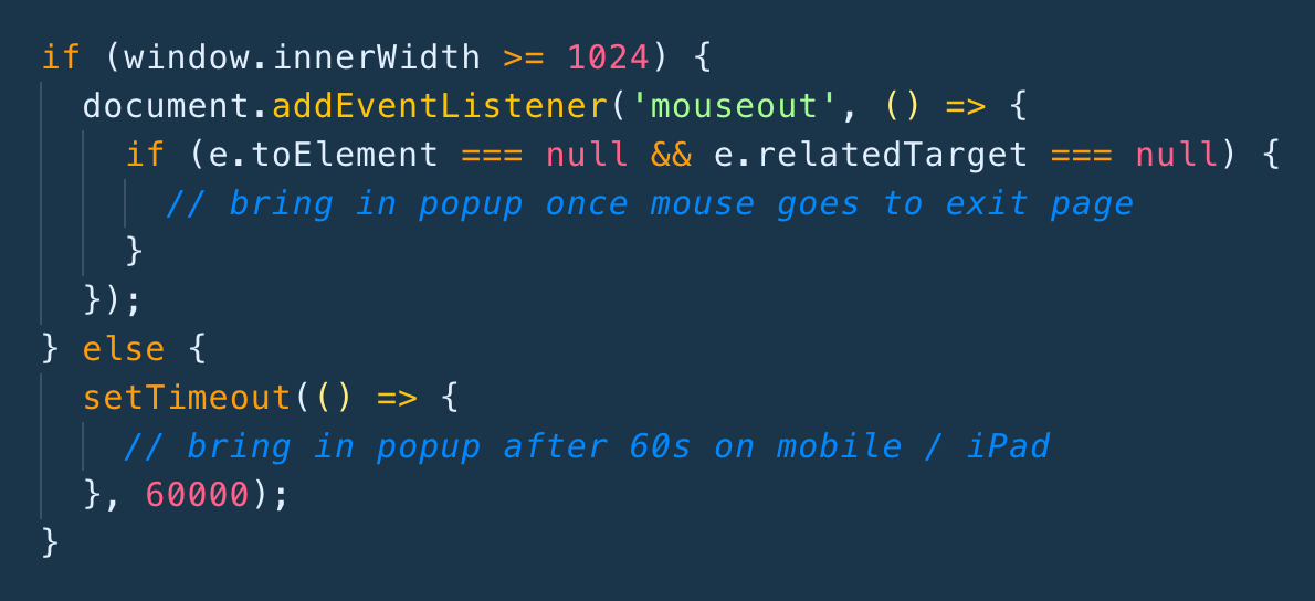
And without code:
1) OptinMonster connects with EmailOctopus
2) MailMunch & Wisepops connect with Mailchimp, Klaviyo etc ...
Most basic exit intent popups default to timeout based on mobile.
Appreciation
Thank you to Steph Smith and Andrea Bosoni for a lot of the ideas.


