
Refactoring UI: A lesson in high prices
Peter Thiel spends 6 months writing down everything he knows about business. His book sells for $10 on Amazon.
Adam Wathan and Steve Schoger spend 6 months writing down everything they know about design. Their “book” sells for $79 online.

Believe it or not, both prices make perfect sense.
Thiel is selling to the masses and the masses are sensitive to price changes (price elastic). If he raises the price to $30 they wouldn’t think twice before substituting his book for one of the many cheaper alternatives on Amazon.
Adam and Steve are selling to hardcore fans and hardcore fans are insensitive to price changes (price inelastic). They've all been following the Twitter tips, watching the screencasts, reading the Medium posts. In their minds, there are no substitute resources available. They don’t want any old design book, they want an Adam Wathan + Steve Schoger design book.
When demand for your good is inelastic, you raise your price. In the case of Adam and Steve, all the way up to $79. As the diagram shows, a 8x price increase (from $10 to $79) results in just a 2x drop in books sold (20k to 10k) and 4x more revenue (shown by the area of the two rectangles).

Step 2 - Escape the context of an e-book
So quite rightly Adam and Steve elected to charge a high price, but that created one problem: You can't just sell an e-book for $70+. People are anchored to what they're used to paying on Amazon. To quote Adam:
The format commands the price. No matter what the content is. And it speaks nothing to the value of the content or the effort that was put into creating it.
So how did Adam and Steve get round this? Well, they set up their own website, added in video tutorials, an icon pack, color palettes, font recommendations, a component library. And then the context changed.
They were no longer selling an Amazon e-book, they were selling an exhaustive design package. And they could charge whatever they liked.
Step 3 - A Persuasive Higher Tier
In addition to the lower tier package of $79, Adam and Steve were also selling a higher tier package priced at $149. And it was this package that they wanted people to buy. The question was how could they present it in such a way to make it appear more compelling?
Well, firstly, look at the hierarchy. The higher tier package takes up twice as much screen space, the font size is larger, and the button color is primary. It doesn't feel right pressing the “Buy Now” button on the lower tier.

Secondly, look at the disproportionately sized discounts. The higher tier package is reduced by $100 (or 40%). The lower package is only reduced by $20 (or 25%). To quote Adam:
If you want people to buy the more valuable package why not make the discount more compelling.
And thirdly, look at the labelling of the higher tier option. The Complete Package infers that if you choose anything less you're missing out. It could just as accurately be labelled The Bonus Package but that wouldn't have the same psychological impact.
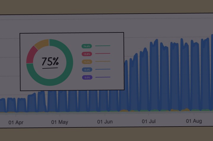
And the subtle tweaks in presentation seemed to work. 78% of total purchases (6765) favoured the higher tier (as of Jan 10, 2019).
In Summary
So, there we have it. Adam and Steve:
• Identified that a hardcore audience called for high pricing
• Escaped the dogma of e-book pricing
• Packaged the higher tier in a more compelling way
and Refactoring UI ended up grossing over $1.35M.
Final Thought
I don't want this pricing lesson to overshadow Adam and Steve's real competitive advantage: being able to justify a price of $149 in the first place. Only in serving up two years worth of free tips, screencasts, and articles is this price possible.
My own heuristic is: The price you can charge is equal to the value you’ve already created.
Nod of Appreciation
The quotes in this case study come from The Art of Product Podcast: Episode 70, where Ben Orenstein and Derrick Reimer interview Adam and Steve. Would definitely recommend.


