
My step-by-step guide to landing pages that convert
There’s two parts of a landing page: what’s immediately visible (above the fold) and what the user scrolls to (below the fold).
Let's start above the fold. To quote Donald Miller, a caveman should be able to glance at it and immediately grunt back what you offer. Here’s my formula:
1/ Explain the value you provide (title)
2/ Explain how you'll create it (subtitle)
3/ Let the user visualise it (visual)
4/ Make it believable (social proof)
5/ Make taking the next step easy (CTA)

1/ Title
There’s one hundred ways to write a great title. I'm going to focus on three.
1/ Explain what you do
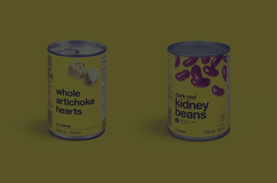
When your product is unique all you have to do is explain what you do as simply as possible.

2/ Hooks
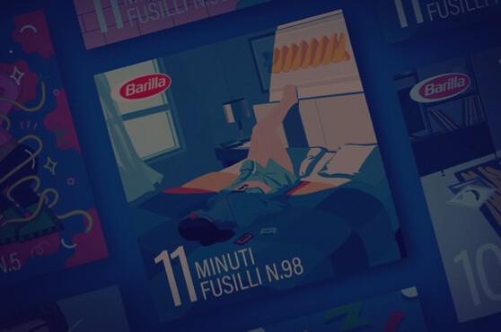
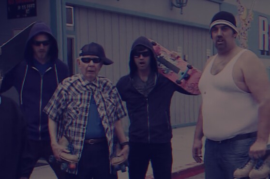
Most products aren't unique. So a hook adds oomph. The easiest way to write hooks is to address your customer's biggest objection.

3/ Own your niche
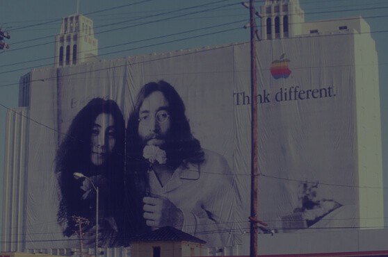
Some startups transcend hooks. Another pattern is to own your niche in one line. Write with conviction. You're THE solution.

2/ Subtitle
Subtitles are where you get specific. Introduce the product. Explain how it creates the value in your title.

3/ Visual
Show off your product in all its glory. The goal is to get as close to reality as possible.
Don't show me fancy illustrations. Show me your product. Or even better, your product in action.

4/ Social Proof
Social proof (above the fold) adds instant credibility to the value you're promising.
Take Privy for example. Any startup can write “How small brands sell more online”. But it's their “18,000+ reviews” that make you believe it.

5/ CTA
Your CTA makes taking the next step easy.
Most buttons emphasise action: Sign Up, Start Trial etc. Here's three more compelling CTA types.
1/ Call to value
Buttons which emphasise “value” over “action” usually perform better. The trick is to fulfil the value your title promises.

2/ Objection handle
Add a few words to your CTA to handle the user's biggest objection to clicking.

3/ Email capture + CTA
Pair email capture with your CTA to make signing up as easy as possible.
This doesn't mean sacrificing customer info. You can collect during onboarding.
“Above the fold” recap
In five seconds customers try to establish whether or not you can help them. Make their life easy. Clarity over creativity.
1/ Explain the value you provide (title)
2/ Explain how you'll create it (subtitle)
3/ Let the user visualise it (visual)
4/ Make it believable (social proof)
5/ Make taking the next step easy (CTA)

“Below the fold”
Above the fold you earn the customer's attention.Below the fold you earn the sale. Here's the last five steps:
6/ Make the value concrete (features and objections)
7/ Inspire action (social proof)
8/ Tie up loose ends (FAQ)
9/ Repeat your call to action (2nd CTA)
10/ Make yourself memorable (Founder's note)
6/ Features and Objections
The first thing you do below the fold is make concrete the value you promise above the fold.
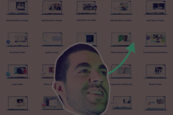
Take Riverside for example. Their title promises “podcasts that look and sound amazing”. Their first two features make this promise concrete.

The second thing you do is handle your customer's biggest objections. This means talking to customers.
Group together reoccurring objections. Use their own words to handle them.

7/ More social proof
Above the fold social proof is about credibility. Below the fold social proof is about inspiring action. It's a free pass to sell your product.
Use existing customers to bring to life the value you promise.
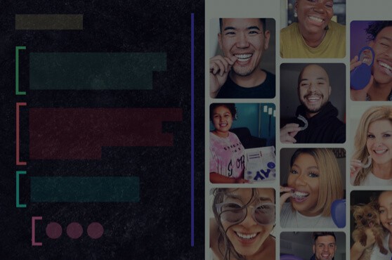
• “Get a smile you love” ⟶ Customers smiling
• “Email reinvented” ⟶ Customers describing the difference
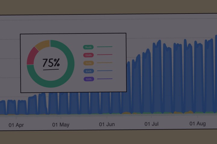
• “How small brands sell more” ⟶ Sales numbers

8/ FAQ
There's going to be features and objections you want to mention that don't fit in neatly above. This is where your FAQ comes in.
Write them down. Reframe into questions and answers.

9/ 2nd CTA
We've done the hard selling. It's time for our 2nd CTA.
This time we've got the luxury of space. So instead of dropping one measly button remind the customer why they're clicking.

10/ Founder's note
Finally, you leave the customer with a story that makes you easy to sum up.
1/ Put yourself in their shoes
2/ Explain their problem
3/ Take ownership of it
4/ Show the happy ending
You're walking them down a path they'll want to walk themselves. Oh, and

Putting it all together
1/ Explain the value you provide (title)
2/ Explain how you'll create it (subtitle)
3/ Let the user visualise it (visual)
4/ Make it believable (social proof)
5/ Make taking the next step easy (CTA)
6/ Make the value concrete (features and objections)
7/ Bring to life your offer (social proof)
8/ Tie up loose ends (FAQ)
9/ Repeat your call to action (2nd CTA)
10/ Make yourself memorable (Founder's note)

One last thing
Your landing page is your sales pitch. Never forget this. Examine each element and ask:
Would this help me sell if I met the customer in person?
If not, remove it. If you don't know go out and sell to customers in person.
You'll learn that fancy words and random images of people shaking hands don't get you far. More importantly, you'll learn the attitude of your customer and the words you need to convince them.
* * *
Phew! That was a long one. Thanks for reading. This is a guide. Not an instruction manual.
Please do share with your pals. I spent goodness knows how many hours on this so it would be nice if a few people read it.
If you found it useful, you'll like my new project Copywriting Examples. It's the world's best copy. In one place. 330+ handpicked examples. All free.
If you'd don't want to miss more marketing guides (like this one), please do join my newsletter.
Thanks to Building a Storybrand, by Donald Miller, Scientific Advertising by Claude Hopkin's, Julian Shapiro's landing page guide, and Demand Curve's Above the fold guide where I got some ideas from. All great resources.
— Harry


